
Itaú Unibanco
Redesign of the Itaú Brand Identity Guides Platform

Context
The project was about updating the Itaú Brand Identity Guide on the Bynder platform. The main goal was to make it easier for employees and partner agencies to access brand assets and writing guides. This ensures everyone follows the same rules and works more independently.
The Challenge
Before the project, there were technical and operational problems:
Access Barrier:
Partners (like agencies and freelancers) could not access materials easily because a corporate login was required.
Wasted Time:
Employees spent too much time sending files manually via email or chat.
Lack of Examples:
The writing guidelines (UX Writing) did not have practical examples, making them hard to use.
Outdated Files:
It was difficult to make sure everyone was using the latest version of the brand.
Research Process
Design Systems Benchmarking
To understand the best ways to share brand materials, I analyzed major global players:

Focused on layout and flexibility.

A reference for technical documentation and accessibility.

High quality in visual guidelines and animation.
User Interviews
I interviewed stakeholders to find problems in the current workflow:
Pain Points
The navigation was too complex, and there was too much "red tape" (bureaucracy) for simple downloads.
Opportunity
Create a single system to connect visual materials with verbal guidelines (tone of voice).
Strategy and Definition
How might we...
Make it easy and safe to access restricted and non-restricted materials.
Improve how we deliver assets to copywriters and art directors.
Ensure all files are updated in real-time.
Ideation and Prototyping
I developed mid-fidelity wireframes focused on information architecture. My first goal was the onboarding page ("How to use this guide") and the core sections:
-
How to use this guide
-
Logos and applications
-
Color and Typography


Design System
To make the Bynder restructure scalable and aligned with the Itaú brand, I created a simplified Design System. The goal was a functional interface where the content is the main focus.
Tokens
Colors
Primary Palette

PMS® Orange 021C
HEX #FF6300

PMS® 000C
HEX #FFFFFF

PMS® Black C
HEX #000000
Base Palette


PMS® Cool Gray 1C
HEX #F1F2F4
PMS® Cool Gray 2C
HEX #E3E5E8
PMS® Cool Gray 3C
HEX #CFD1D3
PMS® Cool Gray 5C
HEX #B3B3B3


PMS® Cool Gray 6C
HEX #999999
PMS® 423C
HEX #6E6E6E
PMS® 424C
HEX #4C4C4C
PMS® 425C
HEX #3B3B3B


PMS® 426C
HEX #262626
PMS® Black C
HEX #000000
Complementary Palette


PMS® 109C
HEX #FFCC00
PMS® 137C
HEX #FF9C00
PMS® 151C
HEX #FF7D00
PMS® 2766C
HEX #000D3C


PMS® 2748C
HEX #000066
PMS® 286C
HEX #0131FF
PMS® 375C
HEX #A6CF2E
PMS® 2426C
HEX #008717


PMS® 357C
HEX #0A3B00
ERROR
HEX #B71C1C
Typography


Spacing
Used an 8px grid system to ensure consistency and a good vertical rhythm across all pages.


Documentation Components
I created specific components to make the information easier to understand:
Smart Download Cards
These show clear details (format, size, and version) under the thumbnail. Users can find the right file without opening multiple tabs.

Do’s & Don'ts Blocks
I used standard icons and semantic colors (red) for quick "what to avoid" instructions.

Iconography
To keep the icon family consistent, I followed strict style rules: 24x24px grid and 2px centered strokes.

Border Radius
The corners follow the brand identity, using the same rounded shape found in the main logo.

4px é usado para botões
10px é usado para imagens/formas
Buttons
Our buttons are designed to stand out. Their main purpose is to help users download assets and navigate to other pages.
Default

Hover
Disable
Usability Testing and Success Metrics
To validate the solution, I conducted moderated tests with 5 participants from different areas (Branding, CX, and Marketing) between June and August 2022.
Quantitative Metrics
Data from the ASQ (After-Scenario Questionnaire) confirmed the platform's efficiency:


Success Rate in completing tasks.
Overall Satisfaction score.
Ease of Use score.

Task Speed score.
Information Quality score.
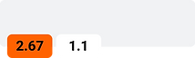
Task Performance

to find Presentation Templates.

to find the Typography and Colors page.
Qualitative Insights
Learning Curve
Described as fast and intuitive.
Perceived Value
Users felt the layout helps them learn how to use brand elements.
Navigation
One participant compared the smooth flow to the Mac filing system.
Iteration and Improvements
Based on feedback, I implemented immediate improvements:
Content Hierarchy
Practical content (downloads) was moved to the top for faster access.
Reduced Noise
Removed duplicate internal menus for a cleaner navigation.
Educational Content
Added videos and animations to explain the brand in motion.
Next Steps and Evolution
The project is now evolving into a complete Brand Hub:
Asset Expansion
Adding photography guidelines, illustrations, and email signature templates.
Glossary Updates
Refining navigation labels to clearly distinguish "Identity History" from "Itaú Corporate History."
Conclusion
The restructure turned the Bynder Guide into the brand’s "single source of truth." The result was a huge reduction in support requests for files, more autonomy for partner agencies, and perfect visual consistency across all Itaú touchpoints.

